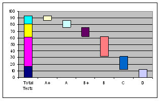
How to make this:
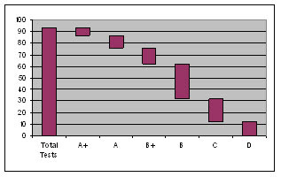
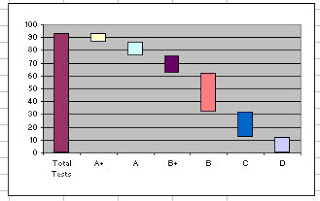
Look like this:

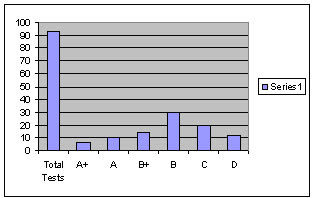
Step one —Create the basic waterfall—all one color. Open excel and put your data in a row—see example

Here the total number of tests (93) are spread by grade-Using the chart wizard, th is data can be put into a simple stacked column bar chart-note the total is the first bar and subseq uent bars represent total for each grade.
Step Two : To create the waterfall effect, a second series of data is created that will disappear (series 1), and cause the real data to float or water fall—note the addition of the second series.
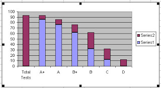
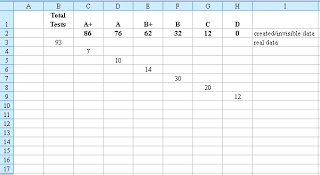
The second series is created by adding a row to the original spread sheet—see the bolded row. Each value is this row represents a portion of a total—-7 of 93 people scored A+, 10 people out of 86 scored A (don’t forget, you need to remove the 7 A+ scores from the total), 14 of 76 scored B+, and so on.
Formula wise, Cell C2 is the difference of B3-C3 (93-7), Cell D2 is the difference between the remainder of the total (86) minus the amount of tests scoring an A (10)—in formula language this is C2-D3. Each cell in the row in completed in the same manner—the f inal value should always be 0 (see cell H2). Once the chart is completed, you will need to go back to the chart wizard and update the source data for the chart to include this new row.

To “waterfall” the chart, series 1 needs to be reformatted in this way:
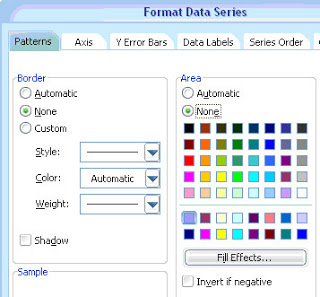
Right click on any bar in series 1 and the select format data series. This will produce the box below—select “none” for border and area.
Series 1 will disappear, and your real data will appear to float. To remove the legend, right click and select clear.
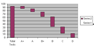
At this point, the chart can be manipulated via the chart wizard to your likin g—change background, remove grid lines, add titles, add text boxes, add values marked into the bars, etc.
What I could not change was the color of each individual bar—until I had an idea of rearranging the data source chart—If each grade (data point) is assigned a specific row, it will become it’s own unique series and thus enable it to be manipulated independent of the other grades (data). If you set your chart up like the one below, you will achieve the independence necessary. Don’ forget to update the formulas in the invisible row and to update the source data selection in the chart.
Step 3: Suppose you want additional data segments shown within the total test bar, like total number of As, Bs, etc. or the number of tests scores by month over a semester? Again, this only requires some manipulation of the data chart.
In the data below, the blue area is now the series charted. Note the 93 Total Test point is outside the selection. The 93 is now represented by 17, 44, 20, and 12. Because each of these is in a separate row/line, each will have a unique color within the total test column, as well as, from the individual test columns already plotted. Remember to update the formula i n the C2 cell to reflect the new placement of the total (93=B14). You will also need to update the series selected for the chart.
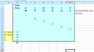

That’s it—all that’s left is the formatting preferences you may want to add—adding data tags, changing colors, adding shading, titles, etc. The only thing I would not add at this point would be text boxes, if you are planning to put the chart into a different program—like PowerPoint. I would add those directly to the slide.
